How we reduced onboarding related support tickets by 93%
The problem
Wild.AI is a powerful mobile app, which optimizes women's perfomance taking into consideration hormonal cycles. The data driven complexities within the experience lead to an overwhelming number of support tickets from users struggling to navigate its core features. If users couldn’t figure out the app quickly, they’d abandon it —losing valuable potential power users. The friction in onboarding was frustrating new users and burdening the support team.
We needed a scalable solution to guide users effectively without increasing operational overhead.
Through the eyes of a user
Since I had just started working at Wild.AI, my own onboarding experience was still fresh in my mind. Even after a few weeks in, I still found myself questioning core functions —so how would a brand-new user feel?
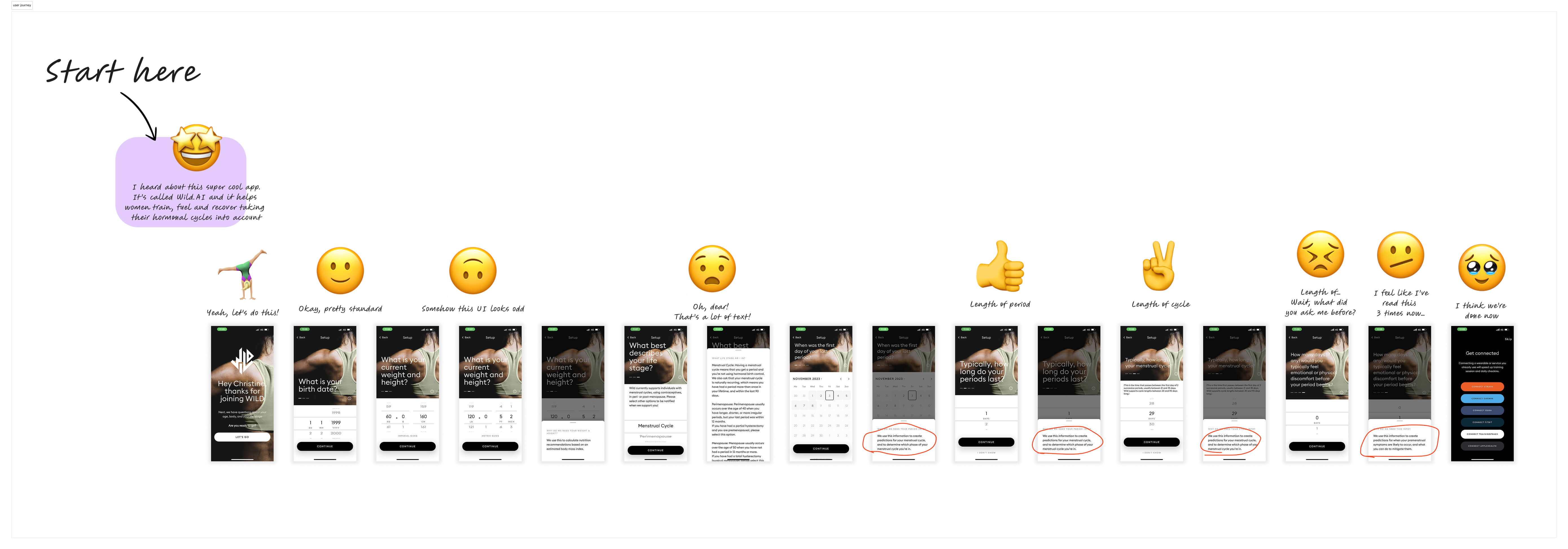
To visualize the problem, I created a user journey map of the current onboarding flow. This helped illustrate how new users felt when landing inside the application.
Evaluating potential solutions
Our initial approach explored two options: an in-app video tutorial library or a YouTube-based knowledge hub. While both offered value, they lacked contextual integration with user workflows` —leaving users in the dark when they needed support the most: at the beginning.

It kinda felt like a mission briefing gone wrong—being dropped into unknown territory by an unnecessarily loud aircraft, with only a rough idea of the end goal but no step-by-step guidance or instructions.
Wait… a step-by-step walkthrough?
Designing the walkthrough
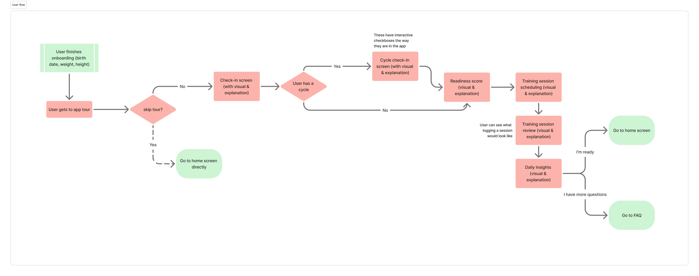
Through a deep dive into the user's experience, and with the help of product, I started to understand the core features that required immediate clarity.
We designed an interactive five-step walkthrough, seamlessly integrated within the app, to teach users how to navigate key functionalities. The walkthrough was crafted to be concise, engaging, and action-driven, while blending seamlessly into the app’s existing UI—accelerating user comprehension.
Once the flows were laid out and presented to development, we started working on the UI elements of the walkthrough.
Implementation & user testing (this was more challenging than I thought)
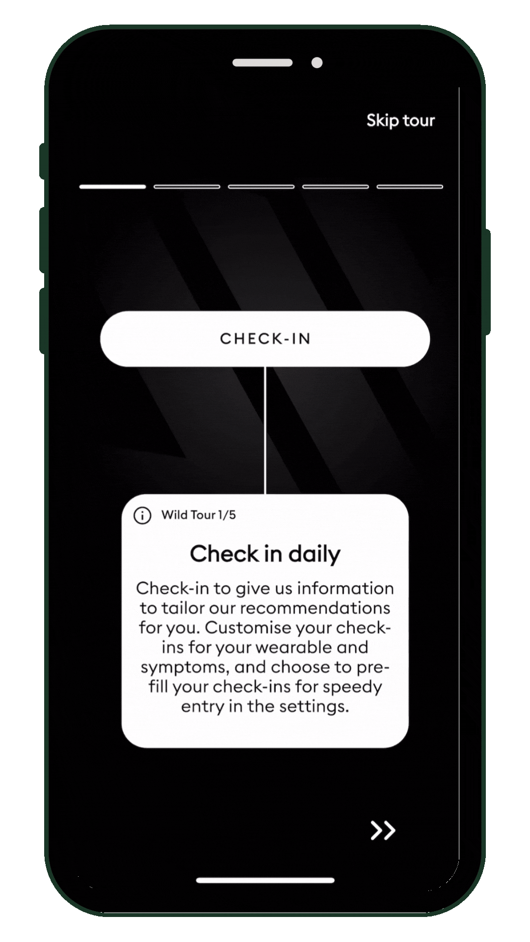
We quickly learned that embedding the walkthrough directly into the app's real functionality would require refactoring legacy code —a major roadblock. Instead, we built a guided overlay that mimicked the user experience without disrupting the app’s internal architecture.
Testing was tricky. Because this was an experience designed for new users, existing testers would skew the data. This led us to source fresh participants from user testing platforms, but finding the right users—active women who valued data-driven training—was a challenge.
The impact
After finalizing tests with a mix of unbiased existing users and **new potential users **(who had been active in the past but struggled to re-engage), we launched a simple yet effective five-step walkthrough.
I was nervous. This was one of my first projects in my new position, and the testing results hadn’t been conclusive, due to the nature of our test participants.
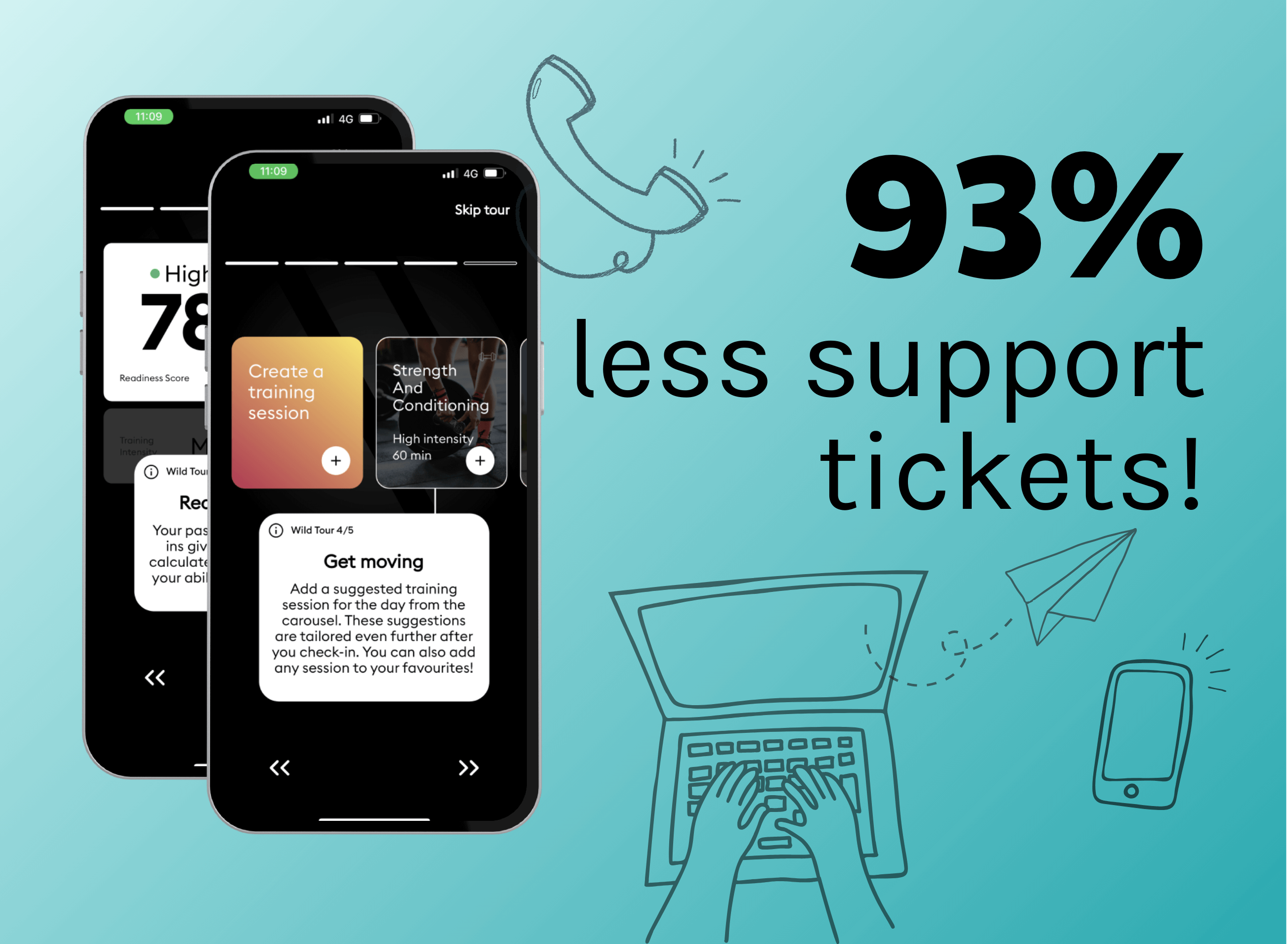
However, my concerns were unnecessary. Within weeks of launch, the walkthrough dramatically reduced onboarding friction. Support tickets related to navigation and feature usage dropped by 93%, freeing up the support team to focus on more complex issues.
Key takeaways
✅ Friction Kills Retention: Users who struggle early churn fast. Onboarding must be seamless.
✅ Contextual Guidance Wins: Users learn best by doing, not watching. The walkthrough delivered support when it mattered.
✅ Work Within Constraints: Legacy code blocked full integration, so a guided overlay provided a smart workaround.
✅ Niche Testing is Tough: Finding unbiased testers in a data-driven fitness niche was challenging, requiring a mixed approach.
✅ Results Speak Loudest: A 93% drop in support tickets proved that user-centered design works.