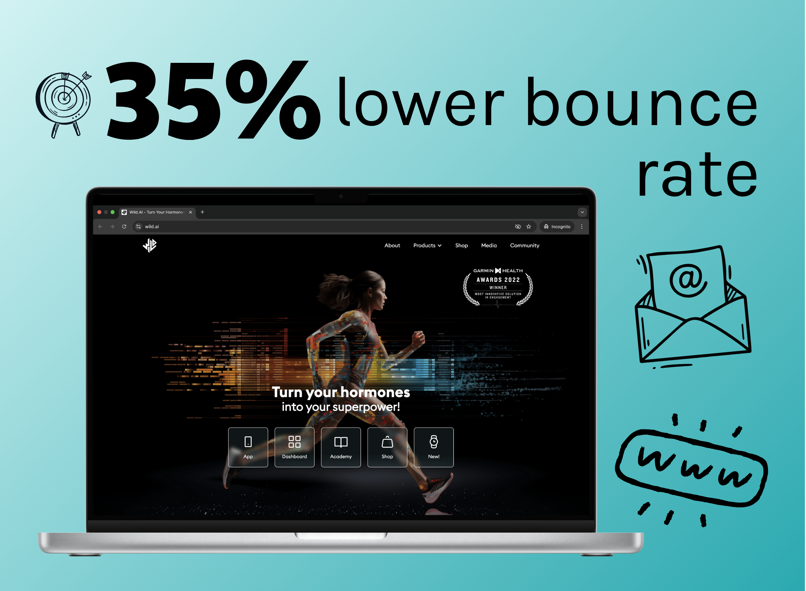
Cutting a marketing website's bounce rate by 35%
Let me introduce you to wild.ai
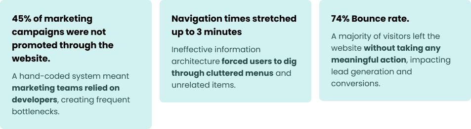
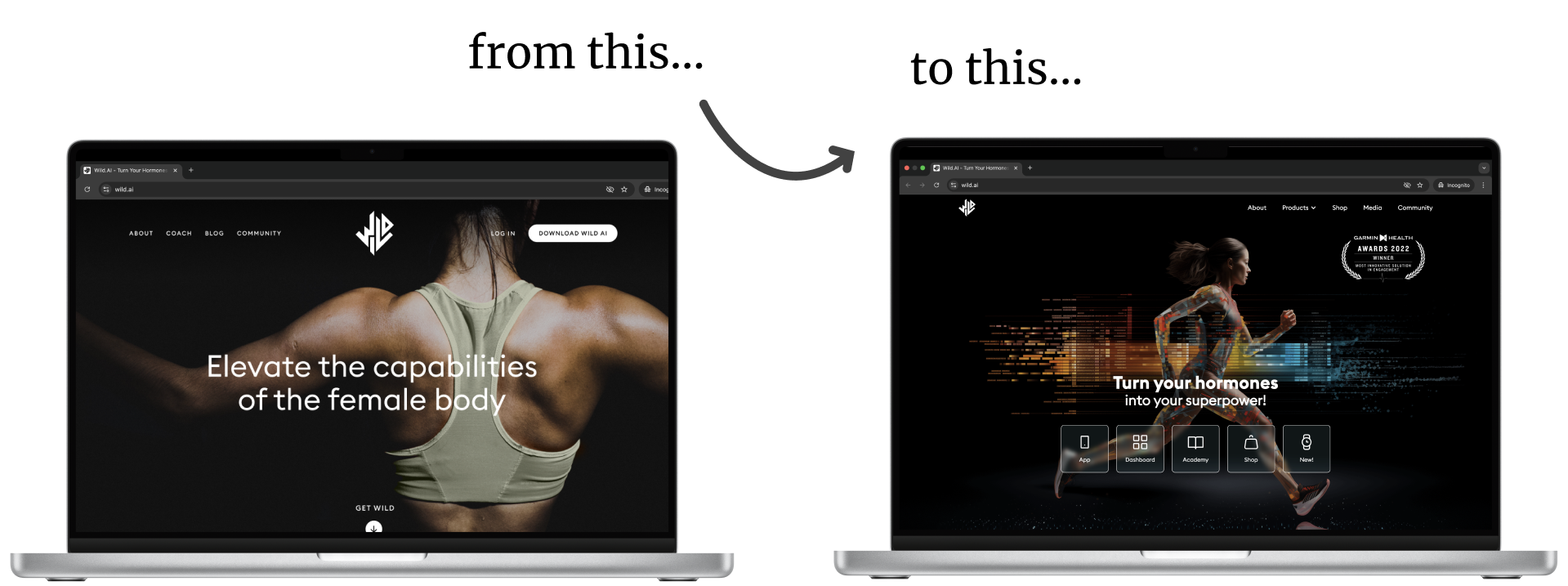
Wild.AI optimizes female performance and wellbeing, taking into account hormonal cycles and fluctuations. Sounds like a cool idea... poorly presented on the marketing website in place, when I joined as a design lead in September of 2022. Here are a few numbers to back up my claims:
A shop window controlled by locksmiths
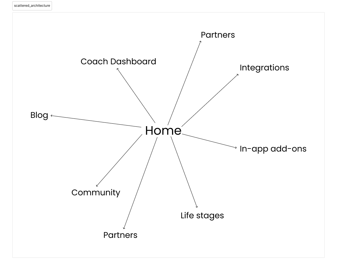
Over time, the Wild.AI website became like a shop window where everything the store offered was thrown in for display —random products, sale flyers, old advertisements—without thought for what customers might want to see or how they’d navigate the clutter.
But here’s the twist: instead of store employees managing the window, only the locksmiths who held the keys could change it. Even adding a small sign required going through them, leading to delays and a rigid and unresponsive system.
As a result, the shop window didn’t reflect the dynamic, innovative brand Wild.AI wanted to project— it was cluttered, static, and out of sync with the needs of both the business and its customers.
What is actually the point?
Let's talk about the bounce rate.In order to fix the bounce rate, we needed to understand what the point of the website actually was. If a visitor lands on the website, what do they see? How is it for them?
The answer was: there was nothing for them. It was a display of the products, offers and things Wild.AI had on display, not about how these would serve its customers.
So, the information needed to be structured in a way that understood (and allowed visitors to understand) whether or not they had come to the right place.
From there, they would be able to decide where to go next, and if Wild.AI was the best solution for them.
Spoiler alert: this approach would end up helping us cutting down that high bounce rate a significant amount.
Four challenges and one success
We identified four major challenges tied to this ambitious plan:
-
Migration would be time-consuming and messy.
-
Moving to Webflow would reduce reliance on developers, but I was the only designer on the team with Webflow expertise, which meant design could become the new bottleneck.
-
SEO and content updates were essential.
-
With the mobile app undergoing visual updates and the brand identity still evolving, the website needed to align seamlessly with these changes.
Over the next few conversations, the collaboration between product, marketing and design solidified and consolidated the feasibility of the project, and soon I found myself in the midst of a full migration to Webflow. Lots of work; but so rewarding!
How much changing is too much changing?
Finding the right balance between change and consistency is challenging. We wanted to ensure that the changes worked for both the business and the users.
The brand identity of both the company and its products was in flux. Meaning the website would need to mirror an aesthetic that wasn’t yet finalized. We knew we couldn’t afford to wait for all the pieces to fall into place; so we prioritized these key decisions:
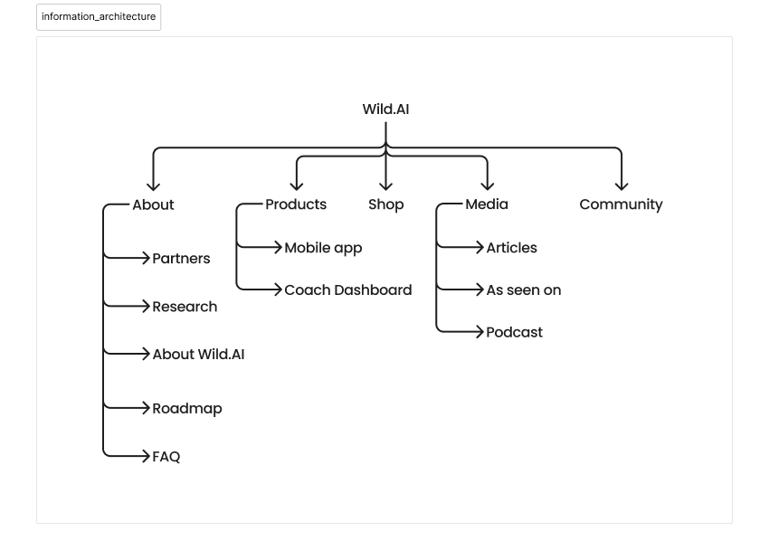
- Simplifying navigation with reduced outbound links and refocused content around the core offerings.
- Incorporating AI-generated imagery to give the site a unique feel, as well as creating flexible brand guidelines to accomodate both the website and the mobile application.
- Balancing change with familiarity by maintaining certain elements, like the logo and tone of voice.
Checking in: 4 months later
Some results are immediate, while others take time to reveal themselves. One of our primary goals —reducing the bounce rate— was something we couldn’t evaluate right away. However, we were able to solve our other two issues:
- Happier, more efficient marketing team: They could now implement promotions, announcements, and event details without waiting on developers, enabling faster decision-making and execution.
- Improved navigation times: Users could now find key information in less than 60 seconds, a dramatic improvement over the previous 3-minute navigation times. Funny enough: the average session duration did not decrease.
4 months later, during a routine analytics checkup: the bounce rate had dropped by 35%! The combined efforts of the migration, improved information architecture, and refreshed content were finally paying off.
The aftermath: what's next?
As with any project, there’s always room for refinement. Over time, a few areas of improvement have become clear:
- Wild.AI’s products and visual identity have continued to evolve. For instance, the color palette has been further simplified, making certain visuals feel slightly outdated.
- One of Wild.AI’s core products was recently sunsetted. Beyond just content updates, this change requires a rethinking of how we present our offerings and guide users to the flagship product.
While the initial redesign laid a strong foundation, this next phase will ensure the site continues to grow and evolve alongside Wild.AI’s mission and goals.
Key takeaways
✅ Clarity Over Clutter: The old site was overwhelming and developer-dependent. Restructuring content helped users quickly determine if Wild.AI was right for them.
✅ Empowering Teams: Migrating to Webflow eliminated developer bottlenecks, allowing marketing to make updates independently.
✅ Smart Changes, Not Overhauls: The redesign balanced new navigation and visuals while keeping key brand elements intact.
✅ Impact Takes Time: Navigation improved instantly, but the bounce rate dropped 35% over four months—a sign of sustained engagement.
✅ Ongoing Evolution: As Wild.AI’s brand and products shift, the site must adapt to stay relevant.